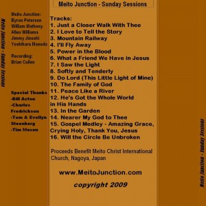
Okay, here’s a little different take on the back and spines for the cover.
It was tougher than last time for some reason, and apologies for putting this off for so long, but I really just couldn’t get the time and the urge/energy to dive back into it.
The text is just not so simple to add as you’re working with some rather limited palette spaces. I added what fit without looking too cramped or messing up the other text and image alignments.
I tried to work on the disk image, but really couldn’t get it to be any better than the one I already had.
Basically, unless there’s something really wrong/bad/unacceptable about this one, I’m ready to move on 🙂


6 responses so far ↓
1 Charles // May 17, 2010 at 5:13 am
Agreed! It looks good. I think it is time to publish.
Pastor C.
2 William // May 17, 2010 at 12:54 pm
It looks fine and I’d say we can proceed. But, if you can make time for a meeting, I’d be willing to sit down with you and tinker a little bit more. If finding time to meet is really difficult, then go ahead. What you have now will fly.
3 Byron // May 17, 2010 at 1:07 pm
It looks good Allen. Let’s publish this thing. I’m chomp, chomp, chompin’ at the bit. Thanks a ton!
4 admin // May 17, 2010 at 3:10 pm
Thanks everybody.
William,
I’m not sure I have time any time soon, but if you’ve got something you really want to add/change that you feel strongly about, I’m willing to talk/listen.
It’s important to keep in mind that as bad as my singing/guitar playing is, my graphics skills are worse 🙂
5 William // May 18, 2010 at 12:30 pm
Here are a few suggestions:
1) put a space before track numbers 1-9 and the titles might line up a little more nicely.
2) Make the “Proceeds benefit . . . ” information into 3 lines, centered with “Proceeds benefit” in the first line, then “Meito Christ International Church” on the second line (centered) and “Nagoya, Japan” on the 3rd line (centered).
3) Should the copyright year be 2010?
6 admin // May 18, 2010 at 3:23 pm
That would be simple, in a text document, but it is a little more involved with a layered image. I’ll see if I can work on it in the next couple of weeks then.
As to the copyright, I found emails from 11/08 where we discussed rehearsals, but final recordings/mixes were done 2009, copyright could technically be 2010 as date of issue (or maybe 2011 🙂
Leave a Comment